Updated August 27, 2026
3D logo materials, and when to use each
The editor ships 84 material presets in 16 families, and 78 of them are on the free plan. They divide into metals that take their colour from the environment, transparent finishes that need something behind them, and solid finishes that carry their own colour. Which family you pick matters far more than which preset inside it.

What materials can a 3D logo use?#
Sixteen families. The counts below are the catalogue as it stands, and every preset is a real entry in the editor's picker rather than a category the interface only implies.
| Family | Presets | Plan | What it is for |
|---|---|---|---|
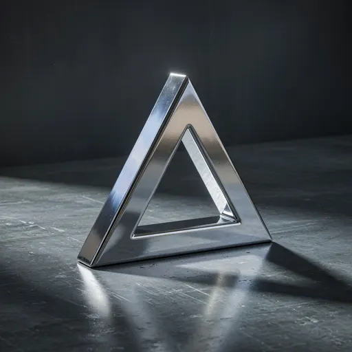
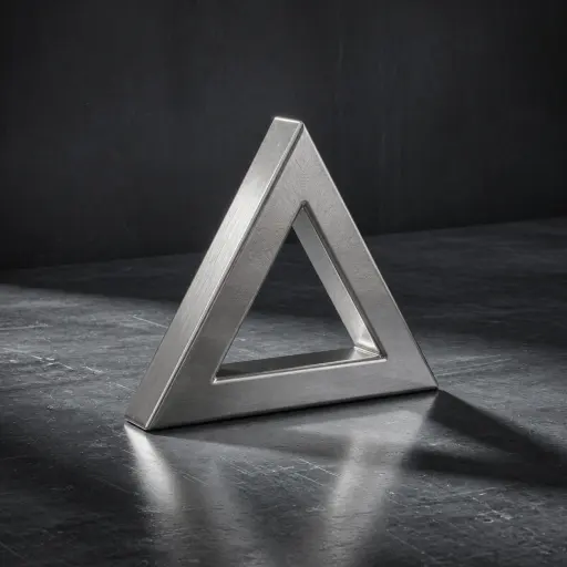
| Forged Chrome | 8 | Free | A neutral mirror. The default choice, and the one that survives being made small. |
| Solar Gold | 5 | Free | Warm metal that separates from a dark ground without an outline. |
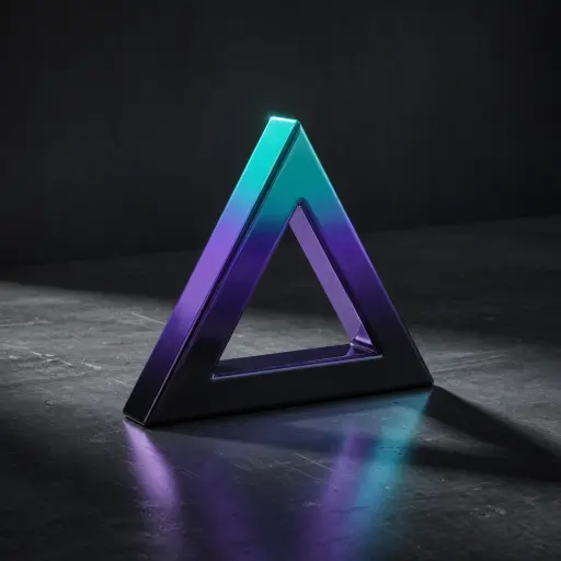
| Cosmic Gradient | 6 | Pro | A colour ramp across the face. Reads as brand colour rather than as material. |
| Galactic Patterns | 5 | Free | Patterned surfaces for a mark that is carrying the whole composition. |
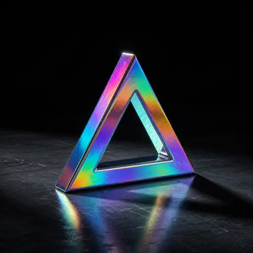
| Holo Iridescent | 4 | Free | Shifting iridescence. Needs size and motion; it disappears below about 60px. |
| Precious Metals | 10 | Free | Silver, copper, and the other precious finishes, for when chrome is too cold. |
| Anodized Metal | 4 | Free | Dyed aluminium. The colour is the metal, with a satin highlight rather than a mirror. |
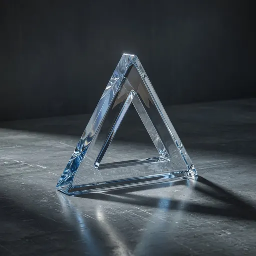
| Crystal Glass | 8 | Free | Transparent and refractive. Needs something behind it or there is nothing to see. |
| Glossy Plastic | 7 | Free | Solid colour with a clean highlight. The closest thing to a flat logo with depth. |
| Hard Enamel | 5 | Free | Opaque glazed colour, the finish of a coin or a badge. Not metal, not glass. |
| Soft Clay | 5 | Free | Matte, unlit-looking surfaces. Good when the shape matters more than the finish. |
| Neon Glow | 4 | Free | Emissive colour that glows against dark. Built for dark UI and video. |
| Velvet | 3 | Free | Velvet and other sheen surfaces, soft edge falloff instead of a hard highlight. |
| Carbon | 2 | Free | Carbon weave. Reads as engineered rather than precious. |
| Natural Wood | 3 | Free | Natural grain, for marks that want warmth rather than shine. |
| Stone & Marble | 5 | Free | Marble and stone, heavy and matte, at home on packaging. |
What actually makes a material look like metal?#
Two numbers, metalness and roughness, and the environment they sit in. Metalness decides whether the surface reflects its surroundings or its own colour; roughness decides whether that reflection is a sharp mirror or a soft sheen. Chrome is metalness 1 with low roughness. Clay is metalness 0 with high roughness.
This is why a chrome logo looks different on every page you put it on. At metalness 1 the surface has almost no colour of its own, so what you are seeing is the environment reflected in it. Change the environment and you change the logo.
It is also why chrome survives being shrunk and holographic does not. A mirror finish produces a bright edge against a dark body, which is structural contrast that stays legible at any size. Iridescence is fine detail, and fine detail is the first thing lost.
The picker gives you presets rather than sliders for these, because the useful combinations are a small subset of the possible ones. The terms themselves are defined in the glossary.
Can you add a surface texture?#
Yes. 5 surface treatments sit on top of whichever material you picked, changing how the surface catches light without changing its colour. They are subtle by design: a texture that reads clearly at full size is usually too strong once the logo is placed.
| Texture | What it does |
|---|---|
| Smooth | No surface detail. The default, and correct for most marks. |
| Scratches | Fine directional wear, so a highlight breaks up instead of running clean. |
| Stripes | Regular ridges. Reads as machined or brushed depending on the material under it. |
| Grid | A cross-hatched surface, closest to a technical or engineered look. |
| Grit | Irregular roughness, which knocks the shine off a metal without making it matte. |
Can you change the lighting?#
Yes, and on a metal it is the most consequential control you have. Eight environments are available: Studio, Sunset, Dawn, Night, Shop, Woods, Loft, and City. Two sliders, Light and Shine, set how strong the environment is and how much the highlights bloom.
Studio is the neutral one and the right default for anything going on a white page or into an icon. The outdoor and interior environments put real colour into a reflective material, which is useful for a hero render and wrong for an asset that has to sit on an unknown background.
If a chrome mark is disappearing against a light page, the fix is usually the environment rather than the material: a darker environment gives the reflection something dark to show, which restores the edge contrast.
Can you use your own font?#
Not directly. The Text panel offers 10 display faces chosen because they extrude cleanly: heavy weights, closed counters, and no hairlines. To use a typeface that is not in that list, set the words in your own tool, convert them to outlines, and upload the result as an SVG.
That restriction is about extrusion rather than licensing. A thin or high-contrast typeface loses its thin strokes the moment it is given depth and a bevel, so a picker full of them would mostly produce disappointing results.
Uploading outlines is the general escape hatch and it has no font restriction at all: once type is outlines it is just paths, and the editor extrudes paths. The SVG page covers what makes a clean upload.
Which material should you pick?#
Match it to the background the logo will live on, not to the look you like in the picker. Chrome and the precious metals want a controlled or dark ground. Glass wants something busy behind it. Plastics, clay and gradients carry their own colour and are the safe choice when you do not know where the logo will end up.
For an asset that has to work everywhere, pick a solid finish. A material whose appearance depends on its surroundings is a liability in a brand kit that other people will use.
For a single hero render where you control the scene, the reflective finishes are the ones that look expensive, and the environment is doing most of that work.
Each of the main families has its own page with the exact presets and one-click links into the editor.
Questions
- How many materials does 3DLogo.io have?
- 84 presets across 16 families, of which 78 are available on the free plan. They range from chrome and precious metals through glass and holographic to clay, neon, velvet, carbon, wood and stone.
- Which 3D logo material is best?
- Chrome, for most cases, because it is neutral and it survives being made small: a bright edge against a dark body stays legible at any size. It is the wrong choice when the logo must sit on an unpredictable background, where a solid finish that carries its own colour is safer.
- Why does my chrome logo look different on another page?
- Because a metal has almost no colour of its own. At metalness 1 what you see is the environment reflected in the surface, so the same preset genuinely looks different against a different background. Use a solid plastic or clay finish if the appearance must be fixed.
- Can I upload my own font?
- No, but you can upload outlines. The Text panel has 10 display faces picked because they extrude cleanly. For any other typeface, set the words in your own tool, convert them to outlines, and upload the SVG; the editor extrudes paths and does not care where they came from.
- Do the best materials require Pro?
- No. 78 of the 84 presets are free, including chrome, gold and glass. Pro changes what you can export, not which materials you can use: no watermark, larger stills and HD video.