Updated August 28, 2026
How to design a challenge coin
Upload the crest or mark as SVG or PNG, or type a short word, then strike it into a reeded, milled, or smooth blank. Set how large the mark sits and how far it stands proud, pick a metal for the blank and a separate finish for the relief, then export a PNG for approval or a GLB for a 3D mockup. No account, and both faces carry the mark.
This produces a render and a 3D model, not a manufacturing file. A mint will want vector artwork and its own die specification; what this gives you is the thing to show people before you commission that.
What is a challenge coin?#
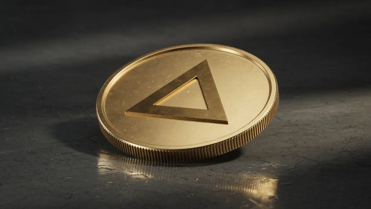
A small struck metal coin carrying a unit, team, or organisation crest, given to mark membership or an achievement. It began as a military tradition and is now equally common in corporate teams, emergency services, clubs, and conferences. The design convention is simple: one bold mark, a legible border, and a rim that separates it from the background.
The reason coins suit this and printed cards do not is that a struck relief reads as an object rather than an image. Depth catches light from whatever angle you hold it at, so a coin looks the same in a photograph as it does in a hand.
That is also the constraint. A challenge coin is small and made of one or two metals, so anything that depends on fine gradients, thin lines, or many colours will not survive being struck. The mark has to work as a silhouette first.
How do you design a challenge coin?#
Five steps, and the first one matters most: bring a mark that already works in one colour, because a struck coin is a one-colour object with light on it.
- Start from vector artwork if you have it. Upload an SVG and the outline strikes exactly; a PNG, JPG, or GIF is traced to vector in the browser first, so contrast decides the result.
- Or type a short word and pick a face, for a coin that is a wordmark rather than a crest.
- Choose the blank: reeded for the fine-grooved classic coin edge, milled for a coarser grooved edge, or smooth for a plain rim.
- Set how large the mark sits on the face and how far it stands proud. A larger, shallower relief reads better at small size than a small, deep one.
- Pick a metal for the blank and a finish for the relief, then orbit and export a PNG for approval or a GLB for a 3D mockup.
What makes a coin design read well?#
Contrast of shape, not contrast of colour. A struck coin has one colour per surface, so everything you can see is either the mark standing proud or the field behind it. Bold shapes, closed counters, and a clear outer border are what survive.
Thin strokes are the usual failure. A line that is thin relative to the mark closes up when it is given depth, in exactly the way it would on a real die. If the crest has hairlines, thicken them before uploading rather than after seeing the render.
Text around the rim is a convention worth borrowing, but only at a size where each letter is a solid shape. Set it in the editor at the largest size that still fits rather than the smallest that still reads on screen.
Two metals help more than detail does. The studio lets the blank and the relief take different finishes, so a chrome mark struck into a gold blank separates the mark from the field without adding a single line.
What else is this useful for?#
Anything that wants a mark to read as a struck metal object. The coin studio does not know or care what the token represents, so the same three blanks cover several jobs that get commissioned separately.
| Use | What to change |
|---|---|
| Challenge coin | Reeded blank, crest at large scale, shallow relief, two metals. |
| Award or medal mockup | Smooth blank, which is the thinnest of the three and reads more like a medallion than a coin. |
| Team or club token | Milled blank, the thickest, for a chunkier object. |
| Loyalty or reward token | A wordmark rather than a crest, set large, on a smooth blank. |
| Crypto or app token art | Any blank; export GLB so the token can turn in a web viewer rather than sit as a flat image. |
| Conference or event badge | Type the event name, choose a bright relief finish against a dark blank. |
Questions
- Can I design a challenge coin for free?
- Yes. The coin studio, the live preview, a 1024px PNG, and GLB, OBJ, and STL export are free with no account. Free exports carry a small 3dlogo.io mark; Pro removes it and adds 2K and 4K stills and 720p or 1080p video.
- What file should I upload for a challenge coin?
- An SVG, if you have one, because the outline is struck exactly as drawn. A PNG, JPG, or GIF works too and is traced to vector in the browser first, which means a high-contrast image with clean edges gives a much better strike than a soft or low-contrast one.
- Can I put a different design on each side?
- No. The same mark is struck into both faces, with the back turned so it reads the right way round when you orbit past the edge rather than appearing mirrored. For two different faces you would render twice and combine the images yourself.
- Is this a file I can send to a mint?
- Not directly. This produces a render and a 3D model for approval and presentation. A manufacturer will want vector artwork and their own die specification. Use the PNG to get the design signed off and the GLB to show it in three dimensions.
- What size should the mark be on the coin?
- Larger than feels right on screen. A coin is looked at small and in the hand, so a crest that fills most of the face with a clear border reads far better than a small mark centred in empty field. Raise the mark scale until the border is just comfortable.